This is the Easiest Way to Design an Impactful Web Page

The easiest way to design an impactful web page starts with a clear understanding of how your visitors are browsing the internet. What are their habits, and how do you best match them with your website? Here are some of the top tips for web page design. You may also want to read up on usability sessions and Mockups, as these are both excellent tools for testing the design of your website. These tips apply to any site, from a blog to an e-commerce store.
Layout grid
One of the best ways to create a visual impact on a web page is to utilize the layout grid. The grid will allow you to customize the design to fit the content on your page best. It will also give you a sense of order by showing how elements interact with each other. A grid is also an excellent way to ensure that your web page looks responsive and accentuates the correct information.
When using a layout grid, images and text will follow the grid’s vertical lines when using a layout grid. You can place design elements within a single column or across two columns. The spacing between columns and gutters should be proportionate and consistent throughout the web page. A grid is beneficial if your web page has multiple pages. You can transfer a strong grid from one page to the next to keep everything cohesive and clear.
A grid can be simple or complex. Using a grid can help you create beautiful, using a background remover to achieve unique designs and perform cool effects such as diagonal typography. Layout grids are more than just lines on a page; they guide and structure your composition. By following a grid, you’ll be able to create beautiful web pages that will attract new visitors and clients. And with so many design options, you’ll never be short on inspiration again!
Mockups
No matter how much you may use a background remover and edit your images when designing a web page, you must use realistic images. Images tell readers more about the brand, the company, or the website than words can, so use fonts that match the site’s style. It is also essential to consider font size. Use the same fonts on all pages to avoid confusion. You can also use placeholder images, but it is still recommended to use accurate content on the mockup.
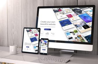
The next step in designing a web page is to use mockups. These are essential for the client’s feedback and showing their potential site to others. Mockups allow you to show them the design and get their opinion on it. Often, these mockups are free, which means they are a good option for clients. However, if your budget is tight, you should use custom-made mockups instead.
A web page mockup tool is available for both Mac and Windows. A free version is available, but a paid plan unlocks more features. Balsamiq is available online and offline and has a desktop application. You can also export your mockup images and share them with an HTML link. You’ll be glad you did! But the most important thing to remember about mockups is that they are the easiest way to design an impactful web page.
Usability sessions
During a usability testing session, you will need to conduct a study with a representative group of users. These users should be real consumers purchasing products from your site. You should not assist the testers but only observe their behavior to get the most accurate results. After the study, you will need to summarize the results. The next step is to decide which improvements need to be made to the product.
The goals of usability sessions include measuring the flow efficiency of the site. The flow efficiency objective addresses the ease of navigation for users. Other plans involve finding bugs in the code and determining whether users can avoid errors. The usability session also looks at the accessibility and user experience of the website. Usability is a critical factor in a successful online venture. A user experience that is both pleasant and easy to use can increase conversion rates and improve customer service.
Using usability sessions is one of the best ways to ensure a product meets users’ needs. Usability testing involves recruiting volunteers and having them use your product. Then, the tester will watch them and take notes on what they observe. Besides visual aspects, usability testing can reveal technical and behavioral problems.
Natural scanning patterns
You may already be familiar with the F-pattern, which applies to all types of digital content, but you should follow it to the letter if you want to use it. This pattern is based on the human tendency to scan pages in an F-shape. Typically, when someone scans a page, they start reading in the upper left corner of the screen, scan the first (headline) of text, and move down the page. The result is a heat map that looks like the letter “F.”
When designing a web page, it’s essential to understand how viewers’ eyes move throughout it. While everyone reads from left to right, there are two primary natural scanning patterns: F-pattern and Z-pattern. For text-heavy pages, the F-pattern is preferred. For non-text-oriented sites, the Z-pattern is best. In either case, it is essential to keep the critical elements as the focal points of the page.
It’s important to remember that people scan pages, not read them, so optimizing for scanning is essential. You should also include a good visual hierarchy, which is the arrangement of elements to indicate their importance. Using an excellent visual scale can dramatically improve page scannability. If you can follow this pattern, you’re on your way to creating an impactful web page that attracts users and keeps them coming back for more.
Body text
A web page design should be centered around the content and objectives of the page. Content strategy involves planning, creating, and managing content. Every page must meet a specific purpose and have a consistent and cohesive design. Content should be concise, clear, and free of jargon or industry-specific terminology. Also, it should be written for a wide range of reading levels. Here are some tips for designing a web page that will make your message stand out.
Calls to action
When designing a web page, calling visitors to take a specific action is critical. You need to know where to place calls to action to maximize conversions. Generally, call-to-action buttons should be located above the fold line. However, if your page sells complex products or services, you should place them after the fold line. Then, you can test where the most visitors are clicking to increase your conversion rate.
When designing a call-to-action button, you should include words that inspire the user to take action. When visitors first see your call to action, they may become confused and unsure of what to do next. That’s why choosing words that inspire action is critical. In addition, a button’s design should be consistent with the rest of the page. Call-to-action buttons are an essential part of a web page, so it’s imperative to create them carefully.
In the Donor Tools example, you can see that the “Sign Up” call-to-action is surrounded by text, and a browser screenshot appears on the right side. However, this element is present to appeal to the visitor’s aesthetic sense and not direct the user’s attention to the call-to-action button. By reducing the whitespace around the call-to-action, you can group the elements visually and ensure that the eye is drawn to the call-to-action button.


